Excluding Prejudicial Demonstrative Exhibits At Trial
January 9, 2013
News and Views on Environmental & Toxic Tort Federal and State Legal Issues and Developments
January 9, 2013
Rule 403 of the Federal Rules of Evidence governs the admissibility of demonstrative evidence at trial, assuming that evidence is determined to be relevant under Rule 401. Pursuant to Rule 403, a demonstrative exhibit may be excluded from the courtroom if its probative value is substantially outweighed by its unfair prejudice, its cumulative nature or if it is confusing or misleading.
Does the exhibit (1) relate to a piece of admissible substantive proof; (2) fairly and accurately reflect that substantive proof; and (3) is it sufficiently explanatory or illustrative to assist the jury? These are the questions used to establish a proper foundation for use at trial.
In addition, the exhibit should convey what it is designed to convey. For example, a computer enhanced photograph should not make an accident scene look better or worse than it actually was. Similarly, the demonstrative evidence should convey representational accuracy. The scale, dimensions and contours of the underlying evidence should all be accurately depicted.
Today more than ever, the creative use of software permits trial counsel to manipulate demonstrative exhibits in ways often difficult to spot.
In an excellent article titled, “5 Demonstrative Evidence Tricks and Cheats to Watch Out For,” Ken Lopez, fouinder of A2L Consulting, provides a useful guide for spotting misleading charts and explains why they are misleading. Lopez discusses five such tricks (which are somewhat difficult to convey without having all of the graphics Lopez uses in his article to illustrate his points):
 1. The Slippery Scale. This trick involves setting the the vertical y-axis on a graph in a narrow range that does not include “0.” By not including “0,” it is easy to make a relatively small change look enormous.
2. Compared to what? If the trial lawyer seeks to demonstrate a small change on a percentage basis, all he needs to do is carry the horizontal x-axis so that time is literally “on his side”
3. The Percentage Increase Trick. How many times have you heard someone talk about a 200% or 300% increase and really wonder what they mean?
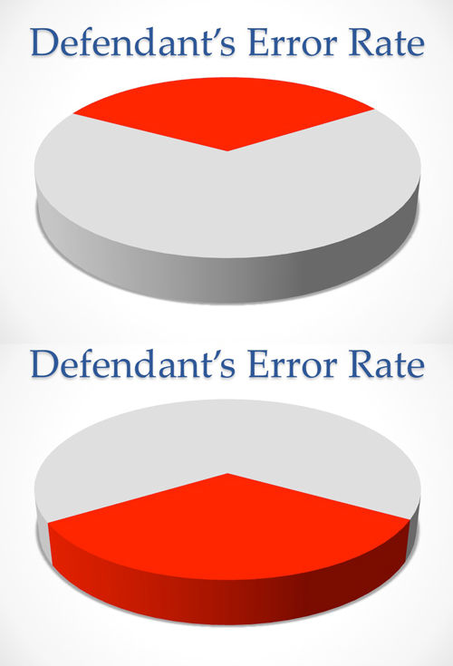
4. Tricking the Eye with 3D Charts. Flat charts with no depth or 3D aspect are harder to trick the viewer with, so always scrutinize your opponent’s charts when a third dimension is introduced. On a pie chart, when a slice of the pie (e.g., the percentage of customers injured by a purportedly defective product) is closer to the viewer, it looks much bigger.
5. Misleading Emotional Imagery. Putting an image of a homeless person in the background of a chart about increasing homelessness is designed to evoke emotion. Similarly, showing an oil-covered bird in the background in an explanation of how much oil was spilled in an accident does not add to one’s understanding of the amount of oil spilled, but seeks to trigger an emotional response in the viewer.
 Perhaps the single most important Rule 403 objection you can make in a jury trial is the exhibit’s capacity to generate an emotional response such as pity, revulsion or contempt. Under these circumstances, the capacity to evoke emotion far outweighs the value of the evidence on the issues before the court and exclusion is appropriate.